Campaign Strategy & Communications
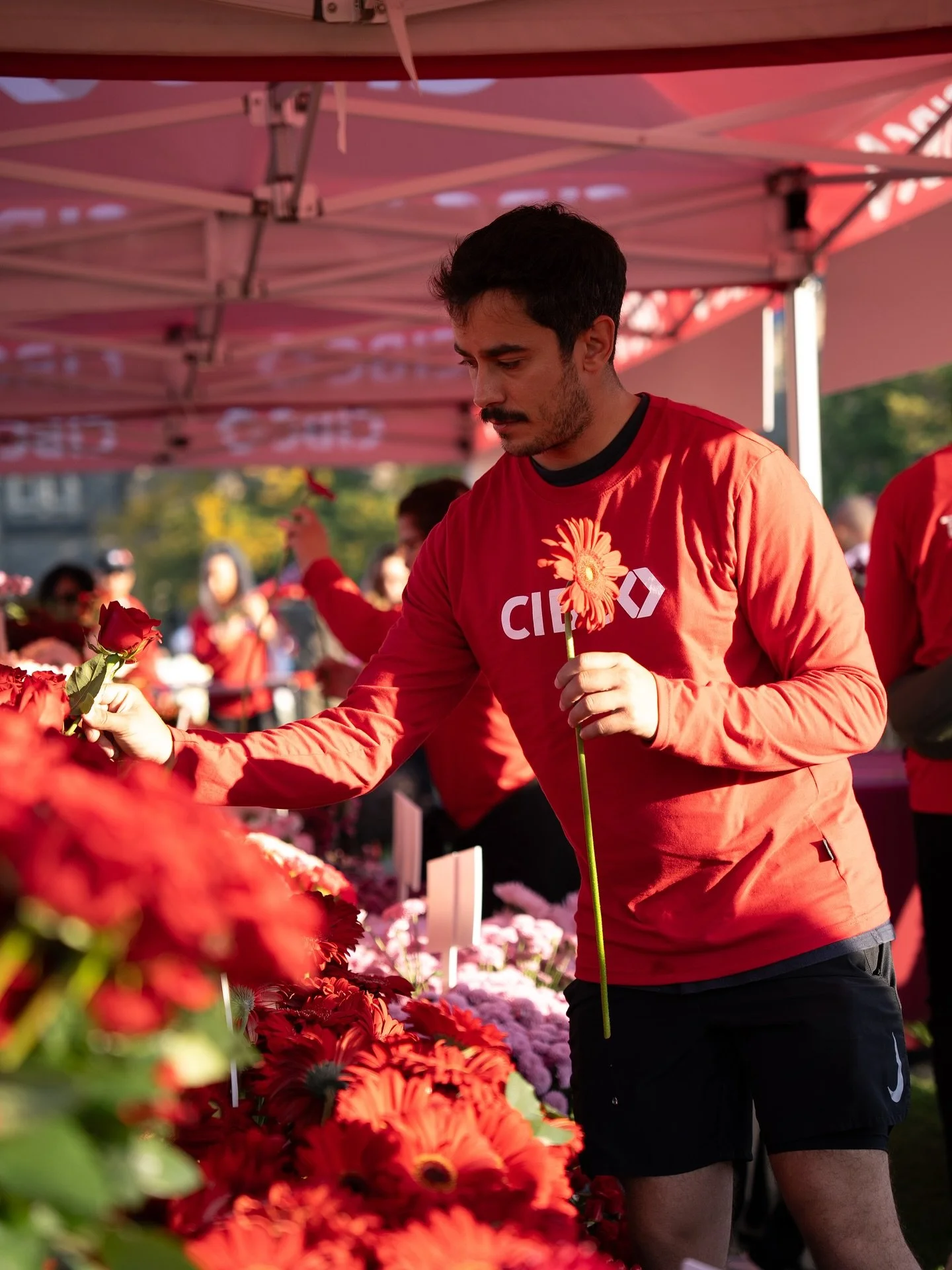
CIBC was a core client of mine at FUSE, and the most rewarding aspect of this account was working on the Run for the Cure each year. I was responsible for the development of a digital toolkit and a supporting email campaign that provided fundraising tools for Canada-wide Team CIBC participants. I also led the creative strategy for on-site activations in major cities like Toronto, Montreal, and Vancouver, which were build your own bouquet stations (with lines literally out of the park) and the chance to win a year-long flower subscription.
CIBC Run for the Cure
39K Flowers Distributed
14K+ Team CIBC Participants
13K On-site Impressions (T.O. & MTL)
900+ Contest Entries
Results
-
Digital Toolkit:
Brief development
Communications strategy
Copywriting
Asset direction & development
Email marketing strategy
Activation:
Brief development
Industry & target research
Activation strategy
Campaign reporting
-
Toolkit: CIBC's Run for the Cure digital toolkit gave Canada-wide Team CIBC participants the assets they needed to fundraise and share their involvement, but it was clunky and text-heavy, sent out once as a static PDF download. That one-time, download-first approach meant lower adoption than it should have had, and with no way to track which tools people were actually using, there was no data to learn from or improve the toolkit the following year.
Activation: Research showed fundraising participants needed to feel genuinely connected to the real-world impact of their efforts (patient transportation, wig services, research funding, etc.) without being overwhelmed by information in a fast-moving event environment. There was also a quieter equity issue: while flagship (Tier 1) run locations consistently delivered a strong on-site experience, smaller (Tier 2) sites were often left feeling like an afterthought.
-
Toolkit: I redesigned the toolkit to be more concise and visually driven, then moved distribution from a single PDF send to an ongoing email campaign. This allowed us to meet participants where they already were instead of asking them to go find it. I planned the cadence and content of each email around key moments in the fundraising journey (e.g., a "just registered" post delivered right at sign-up), and used unique tracked URLs for each asset so we could finally see which tools people were actually using and improve the toolkit with real data going forward.
Activation: To help participants feel connected to their impact, we used a simple icon system representing each impact area, paired with high-level on-site messaging and QR codes for anyone who wanted to learn more. This let us be informative without overwhelming people in the moment. To close the gap between flagship and smaller sites, I extended our most popular Tier 1 activation (a build-your-own-bouquet station) into a Tier-2-exclusive contest for a year-long flower subscription. This gave smaller communities their own dedicated and exciting moment rather than just a scaled-down version of the flagship experience.
Overview